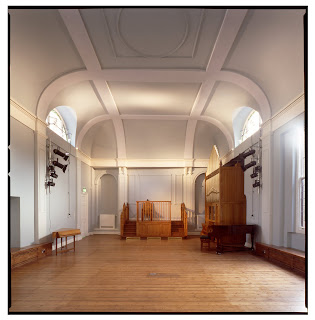
This month our office celebrated the opening of The Founders' Hall for Hill House International Junior School. I would like to describe my experience in choosing the colour scheme and its influence on the scheme design, as it was something I enjoyed doing.
Colour has a fundamental role in our perception of the built environment, which can affect our mood and behaviour. It also has the power to improve aspects of our lives such as health, security, emotion and feeling. Different people will perceive light and colour in different ways, and furthermore, architectural context has a strong influence on this perception. Despite the importance of light and colour, it is not unusual for this to be considered only in the latter stages of design. The reason for colour choice is almost never questioned. Colour is considered secondary to building form and structure, reflecting attitudes held by many design professionals.
Nothing changes interiors more than colour. Colour is a tool, used together with lighting as a necessary and vital component of a building to create a sense of drama in interiors. Colour and light belong to a single radiant spectrum, so without light, colour cannot exist. The use of colour can be understated or dramatic with boundless possibilities in changing the tone of space.
I started by becoming familiar with the history of the building. The hall is built in the grounds of a manor house, leased in 1838 to Mr Richard Smith and then developed by him. A tavern was opened on the site of the Chelsea Potter with pleasure gardens to the rear of the Manor House. A hall building was constructed adjacent to the tavern. In 1842 these were known as the Commercial Tavern and Commercial Rooms, or Commercial Hall. The hall was built in a Grecian neo-classical style, popular in the 1830s. The terraced row of houses to the south of the hall were built in 1845.
The hall was extensively refurbished in 1851 and became a popular venue for military balls. The building was acquired by the Congregational Church in 1855, passed to the South Kensington Primitive Methodists after 1860 and then on to the Welsh Congregational Church in 1880. The building was used by them until 2008. The building was listed Grade II in October 2008. In 2009 the former Welsh Church was purchased by Hill House International Junior School.
As I found out, many historical colours were muted because vibrant chemical dyes had not been developed, but a few stronger colours were available. The stronger colours were expensive and so used for details or highlights. Pastel colours were used in most interiors. The cheapest and therefore more typical colours were shades of grey, light blue, brown and olive green, and then chocolate for doors, skirting and other woodwork. Whites at this time were slightly grey or yellow. So this was the palette I chose to follow.
I decided to choose a softer neutral colour palette based on the Georgian grey colour rather than the bright, bold options. I knew that neutral-toned spaces create a sense of calm. I mixed tones using very slight variations of colour. A subtle palette was the key for me while keeping to historical colours. In order to highlight the importance of the building, I wanted to find a sense of balance using paints and light to create an intimacy between the colour, lighting and other elements in a given space.
I initially focused on the smaller existing elements like the colours of the obscure glass in the main Hall. I was looking for a perfect balance between history, existing details and lighting, and to add elegance to the space. The choice of tones and colours was crucial to highlight the existing structure of rib arches and columns and expand ceiling space.
A perfect style is summed up in three words: texture, shape and tone. Colour in interiors should be always checked against a neutral background and in natural light. The finish of a surface communicates meaning, which can be smooth or sharp, and accentuated by the paint finishes as well. Paint can be oil or water based. Oil based paint is durable and longer lasting while water based is easier to clean.
Finishes vary according to how much light they reflect such that with oil based paints, eggshell paint provides mid-sheen, and gloss paint offers a shiny, durable coat. With water based paints, matt paint has no sheen at all and it is always warmer than gloss.
Everyone sees colour in different ways and we never observe colour consistently. People often try to make judge or criticise colour choices out of context, or representing personal views that are inconsequential.
Colour can be identified by hierarchy, opposition, separation, connection, transition and assimilation. Colour choices in the conceptual phase, although abstract and diagrammatic, will begin to influence choices in lighting, materials and surfaces that continue throughout the design process. Light and colour are our builders of space.
Dominika Kruzel-Scigalska
No comments:
Post a Comment